
By
Your homepage is your site’s first impression. It’s the launchpad to the rest of the site and a glimpse into your company’s brand and mission. No pressure, right?
As a UX/UI design agency, we’ve had a lot of practice in designing beautiful and user-friendly sites. Take a look at what should go into your homepage design.
Your site’s homepage should be a window into your company’s value proposition. It lets site visitors know what they should expect from not only the rest of your website, but from working with your company in general. It’s a brand awareness and lead-generating tool, which is why we place a lot of emphasis on its appearance, layout and content.
Good homepage design can also make or break your site traffic metrics. From pageviews to bounce rate and even your conversions, having a nice homepage that's designed with UI/UX principles in mind allows customers to naturally move through your site or immediately find what they were looking for.
In addition to the standard elements of a homepage — which we’ll get to in a minute — you need to make sure your homepage addresses fundamental questions:
Who are you? What’s your mission and vision as a company? Make sure your brand and your value proposition is known, right away, through strong design and messaging.
What is it that you offer clients (your services)? What problems can you help solve? Your site as a whole should address visitors’ pain points, and your homepage should give them a taste of how you can do that.
How do you work? What are your methods and practices? Make it clear what your differentiators are and why your audience should pick you over competitors that offer similar products or services.
What you’re saying is one thing. How it’s being displayed is another. There are some standard elements of a homepage’s design that you definitely want to include.

This is the first thing visitors see. It’s not always just a static image, it may include an eye-catching video, along with an intriguing H1 headline that prioritizes a keyword or set of keywords that confirm to the user that they’ve landed in the right place. Want to go further? Include a relevant call to action (CTA) within or in close proximity to the hero image to encourage visitors to act in a specific way. The homepage we designed for Anders CPAs + Advisors incorporates a subtle, sound-free video that blends behind their unique branding and geometric design, creating impact without distracting the user.
If you’re torn on which way to go with your hero design, A/B testing two designs can be a great way to see how actual users interact with your homepage and can help you adjust the design accordingly.
Your homepage may be a visitor’s first impression of your site’s beautiful, user-friendly navigation and information architecture. There a four principles of site navigation we recommend you follow:

We briefly mentioned the importance of CTAs above, but it’s worth a deeper dive here. Remember, your homepage design is not meant to be overly informational or simply beautiful. Your homepage gives you the opportunity to craft the movement of your users through your company's products and services through the use of simple and clear action opportunities, such as finding your location (as seen on the bathroom remodeler, Re-Bath’s, homepage that we designed).
Other calls to action may include:
This links to landing pages or singles with more information about specific topics.
This connects a user to content that helps users solve their unique problem(s) like blog posts.
These are the types of calls to action that may read “buy now,” “contact us” or “try today.” At this point, the user is ready to make a decision. This is the most important CTA and should be visually different from the others (i.e. a solid red button vs. an outlined black one).
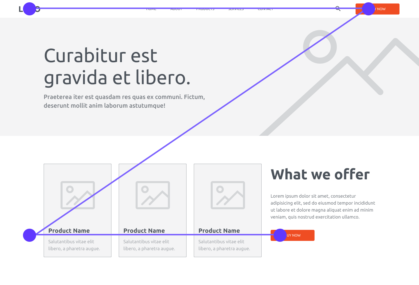
We like to tell clients that the best homepages have a z-shaped scanning pattern. What does this mean? This type of design traces the natural route that a human eye takes while reading (left to right and top to bottom). First, people will scan the top left to the top right. Next, they scan down and to the left side of the page, where they’ll read left to right again.
This means that, in homepage design where simplicity is key, we’ll include the main components in the top horizontal line, build up to relevant CTAs on the diagonal, and include the CTA along the bottom horizontal line. Side note: this is why you’ll often see short forms on the right-hand side of a page.

In addition to having consistent design conventions for buttons (i.e. using the same color scheme throughout the site or using a single hover state), you’ll want to make sure your buttons are encouraging and understandable. Avoid “click here” language — users tend to gloss over that.

The best footers serve as a quick sitemap and have all of the information a specific user type will need, including company address, phone numbers, and social media links, as well as jump links to your most important pages.

In this day and age, it should go without saying that your site must be responsive on mobile devices. In addition, you should build your homepage with mobile views in mind — make it easy to click around, scroll through and read.
On Siteman Cancer Center’s site, for instance, we created a simple, easy-to-navigate homepage design design that shows mobile users what they’re looking for. (Side note: Siteman even won an award for “Best Mobile Site” when we assisted with their redesign a few years back.)
So now that we’ve seen what makes a great homepage, we should probably talk about what makes a not-so-great homepage. Here are some homepage design elements that you want to be wary of:
Sure, a pop-up can be a nice way to put a CTA right in front of your visitor, possibly getting them to fill out a short form or subscribe to your newsletter. But having multiple pop-ups, pop-ups that trigger too fast, or those that the user can’t easily get rid of can create a poor user experience — one that may cause your user to simply leave your site altogether.
There are some plenty of sites that tastefully use videos to supplement their homepage. But one thing that’s sure to drive users away is having videos automatically play with the sound on. Keep things subtle.
Eye-catching imagery can be a great way to grab your visitor’s attention and support your content. However, large, unoptimized images that don’t translate well to mobile will hinder your homepage’s impact.
Have a lot of great information and a beautiful design, but no clear path for users? Whether it’s including too many calls to action or simply not making your primary call to action known,
---
Ready to partner with a web design and development company that understands your goals and builds beautiful websites? Contact Integrity today to begin.

%20(1).png)


